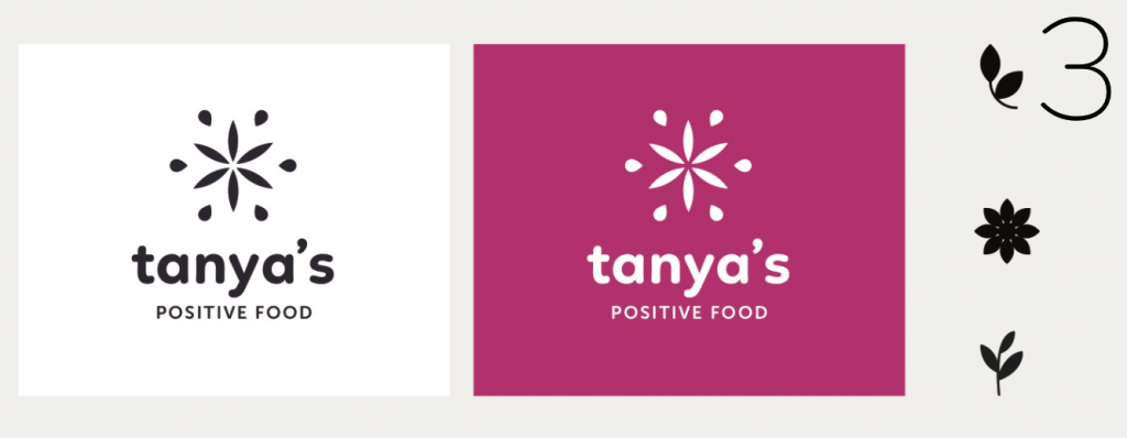
My friend, I'd loooove your trusty opinion! 🙋 You already know we are remodelling, but you may not know we are rebranding simultaneously too... My beloved raw food restaurant in Chelsea, London will focus on a retail offering, my workshops and nutritional mentoring for new'ish mums. My plant-based cakes, juices, salads, coconut jerky, etc are going to be stocked all across London shops, cafes and fitness centres, so naturally we felt the need to update our current logo (pic 1) to reflect the warm, nourishing, energising, positive and loving natural brand that we've been nurturing for years. Please could you share in the comments below which one of the pics (2, 3 or 4) sings to you and why. Thank you so so so much, I value your thoughts more than anything! P.S. A little more about our brief for the rebrand is below...


I'm coming to you, because this exercise is 'a bit too close to home for me' and since I've witnessed the evolution process with a hundred examples by now, I'm hoping that you can help me make a decision! About current logo: My dear friend in NZ designed it and I love it that someone who knows me well is behind this interpretation of my living food. (It's a flower of life with a seed, that stems from the middle, plus this very seed is used as the apostrophe in 'tanya's'.) She had no brief and no time to pull something together when we were opening the cafe, and I have enjoyed this stamp for almost three years now. It is time to ditch the 'Experience Raw' tagline, because although my food is plant-based, it is not exclusively raw. Also as we are testing out our packaging for different stores, everyone agrees that the current intricate logo design gets lost on shelves. About the new business model: Tanya's is no longer just going to be a restaurant. In fact, there will be no restaurant. MY Chelsea hotel will be an outlet for our products, as will the likes of Planet Organic, Whole Foods, etc. The products like your favourite PB Choc Cheezecake, Matcha Mylkshake, Coconut Jerky and Raw Lasagna will be made off-site and delivered daily to our various stockists, then anyone who visits our star location in Chelsea, will be able to grab their treats and either take them away or pick a seat in the beautiful remodelled hotel lounge, which was the original Tanya's conservatory and terrace. (Think PRET A MANGER, just more fancy, more exclusive, healthier and fully organic.) BetterRaw.com and TanyasCafe.com will also be consolidated into one website, which will offer whole cakes to order, mentoring packages, my books, cleanses and more raw food classes. The brief for new logo: A strong and proud mark that would distinguish my products from the competitors, yet still have the feminine touch of beauty and elegance. It was also important to me that it feels positive, exciting, energetic and friendly. I personally have a unique multi-cultural upbringing, since I was born in Russia, grew up in New Zealand with my Russian parents and sister, got a Kiwi accent, married a Kiwi and now along our our baby girl we are both British citizens, enjoying life in glorious London. I was named after my grandma Tanya, who was an amazing cook (all women in my family were/are), so really this brand is named after my grandma (just cooler hopefully, more luxury most certainly and although still hearty- way waaay healthier), so it has to feeeel authentic and established too. I don't ask for much, do I? :))

